I’ve told you about a recent project that I did for my pastor’s daughter. I scanned pictures of her and her soon-to-be husband and put them into a Power Point presentation, which was shown at the wedding reception. It was a lot of work, but also lots of fun.
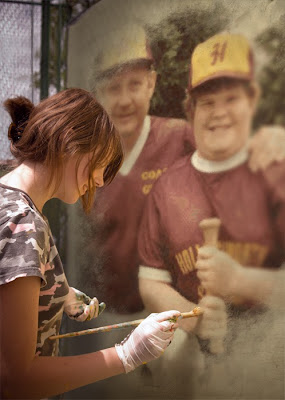
Today, I’ll share (with permission) some photos of the groom, Terry.
 |
| I used Photofunia to create this introductory image. |
 |
| Terry and his dad |
 |
| The photo after lightening foreground and darkening background |
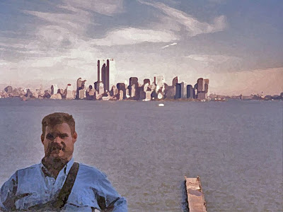
In this photo, Terry was in dark shade and the city was in brilliant light. Photoshop Elements helped me to correct this a bit, but the result (above) was not very good. What to do?
 |
| After the filter |
I applied a filter in Photoshop Elements to make it look like a painting. I like this effect better.
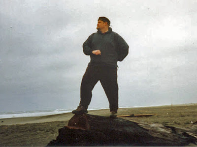
There was also a neat picture of Terry in a heroic pose atop a large rock. It looked like this:
 |
| The photo after minor touch up |
I love this shot. The man, the pose, the pedestal and the lake. Yet, I felt something was missing. Once again I turned to Photofunia.
 |
| A Photofunia effect adds drama |
This was a lot of fun, but it took a lot of time. I just wanted you to know I wasn’t idle while I was away from here. (Perhaps you can begin to understand why I bought a new monitor after seeing these on a large screen.)
Thursday, I’ll post some pictures of the bride. At least that is my intention.

Wow! That was a TON of work! I sure hope they appreciated all your hard work, Chuck!
I like your effects. 🙂
I am sure the bride and groom loved all of the care you put into the presentation.